This article shows different ways of plotting WATLAS position data. In these examples, we use a simple basemap with the extend of the data, but any other type could be used too (see Article Create a basemap).
We first present some examples of plotting data grouped by tag ID, then by species, and then by individual. These individual plots allow quickly check the data. We end by whoing how to plot heatmaps of the position data. These examples give a starting point, and can be customized as desired.
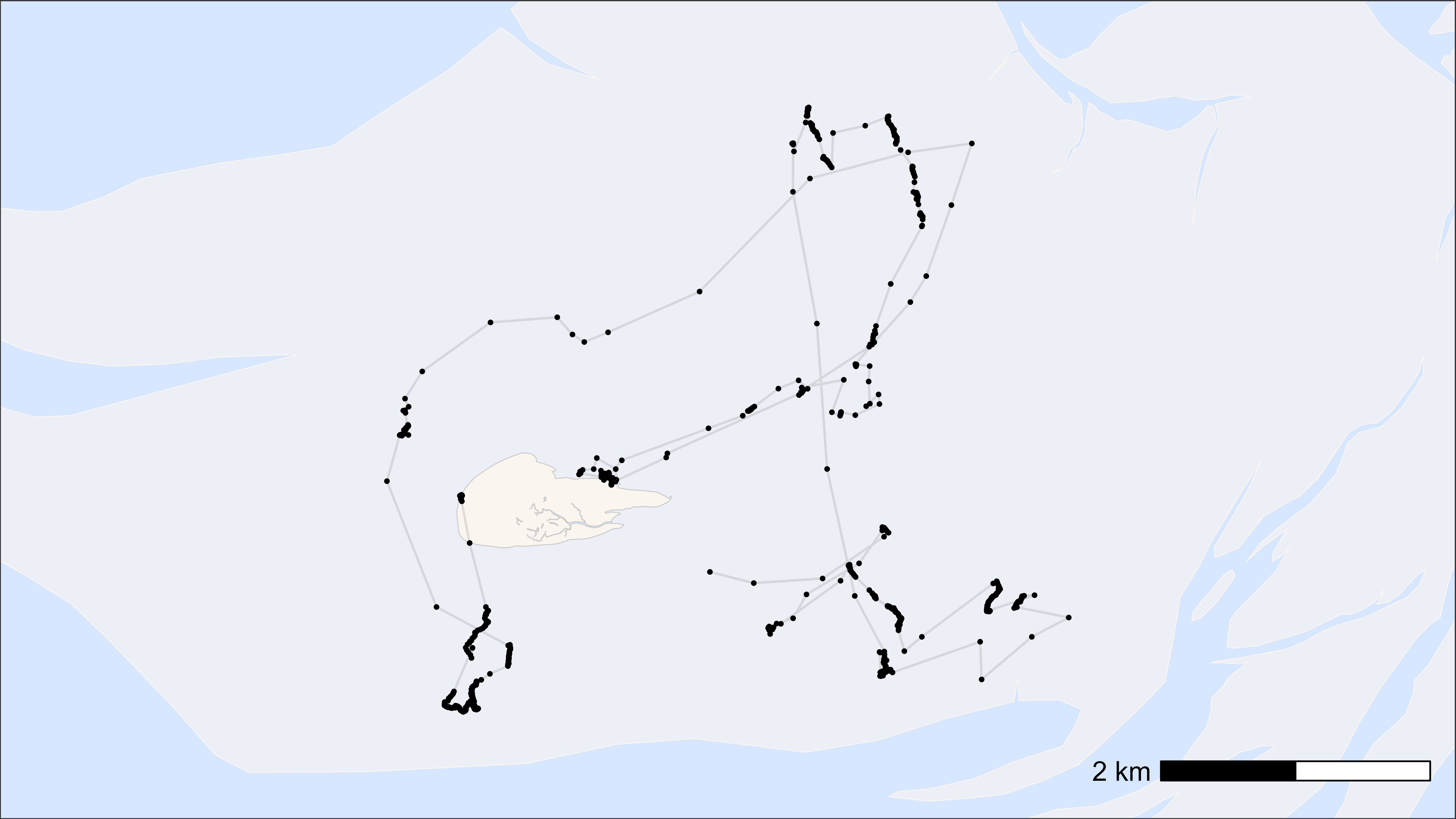
Plot by tag ID
Here, we show how to plot movement data grouped and coloured by tag
ID. The number of tags can, for example, be added to the legend if
desired. When one needs consistent colours for individual tags between
plots, one can use atl_tag_cols(data$tag) to assign them
(see second example).
# load example data
data <- data_example

# create basemap
bm <- atl_create_bm(data, buffer = 800)

# plot points and tracks with standard ggplot colours
bm +
  geom_path(
    data = data, aes(x, y, colour = tag),
    linewidth = 0.5, alpha = 0.1, show.legend = TRUE
  ) +
  geom_point(
    data = data, aes(x, y, colour = tag),
    size = 0.5, alpha = 1, show.legend = TRUE
  ) +
  scale_color_discrete(name = paste("N = ", length(unique(data$tag)))) +
  theme(legend.position = "top")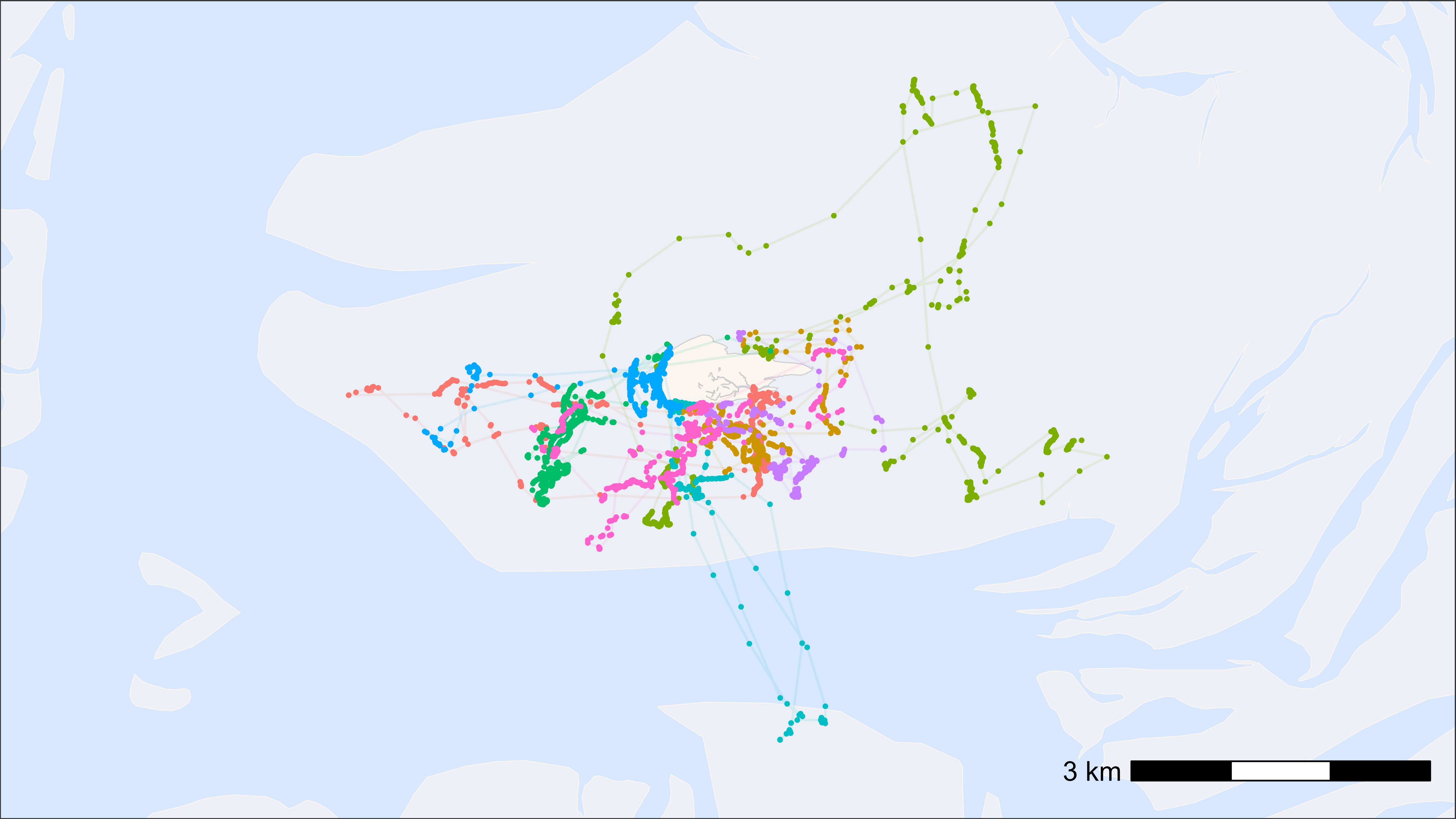
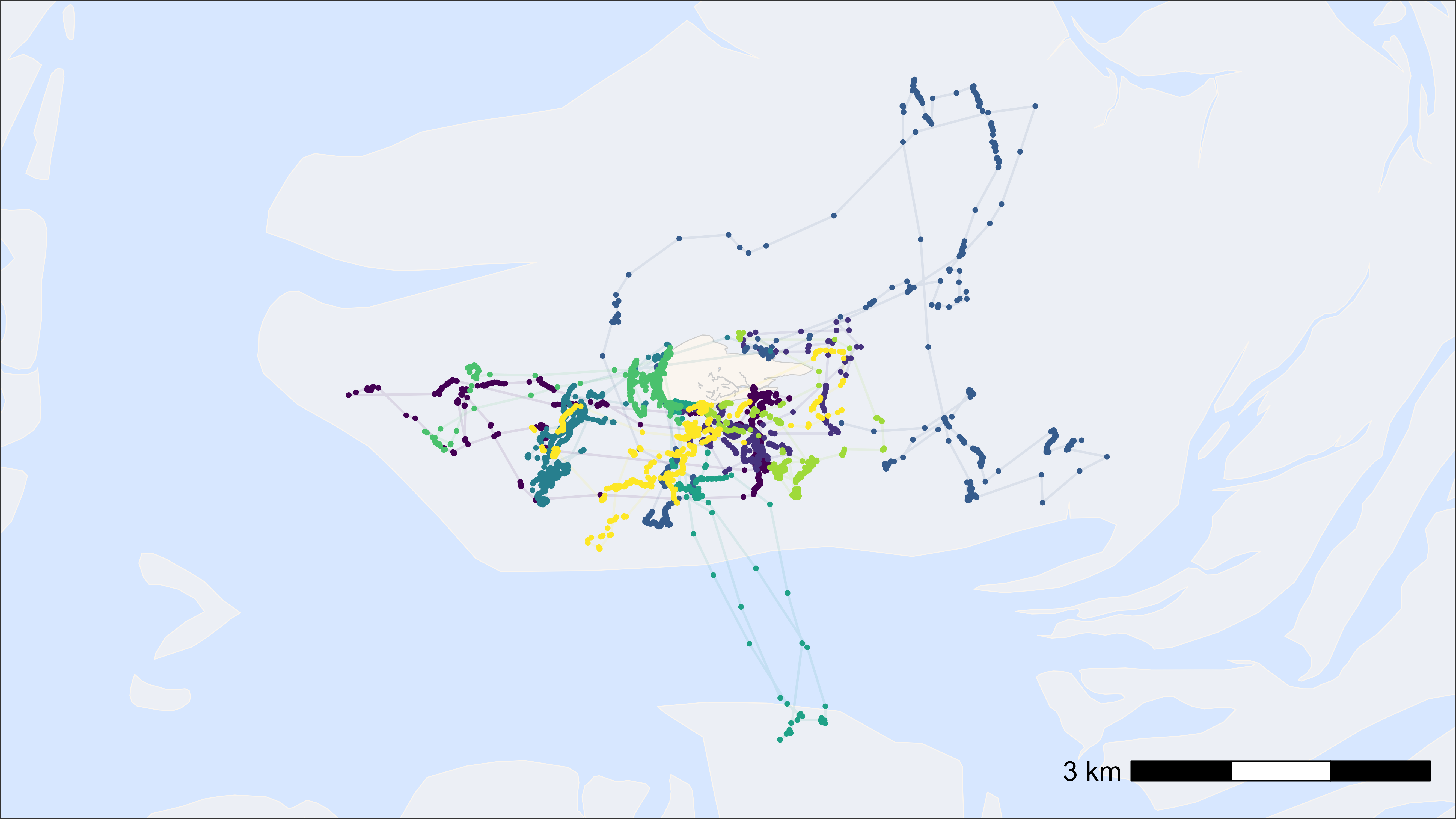
# plot points and tracks with fixed assigned colours (e.g. in animations)
bm +
  geom_path(
    data = data, aes(x, y, colour = tag),
    linewidth = 0.5, alpha = 0.1, show.legend = FALSE
  ) +
  geom_point(
    data = data, aes(x, y, colour = tag),
    size = 0.5, alpha = 1, show.legend = FALSE
  ) +
  scale_color_manual(
    values = atl_tag_cols(data$tag)
  )
# plot points and tracks with viridis colour scale
bm +
  geom_path(
    data = data, aes(x, y, colour = tag),
    linewidth = 0.5, alpha = 0.1, show.legend = FALSE
  ) +
  geom_point(
    data = data, aes(x, y, colour = tag),
    size = 0.5, alpha = 1, show.legend = FALSE
  ) +
  scale_color_viridis(discrete = TRUE)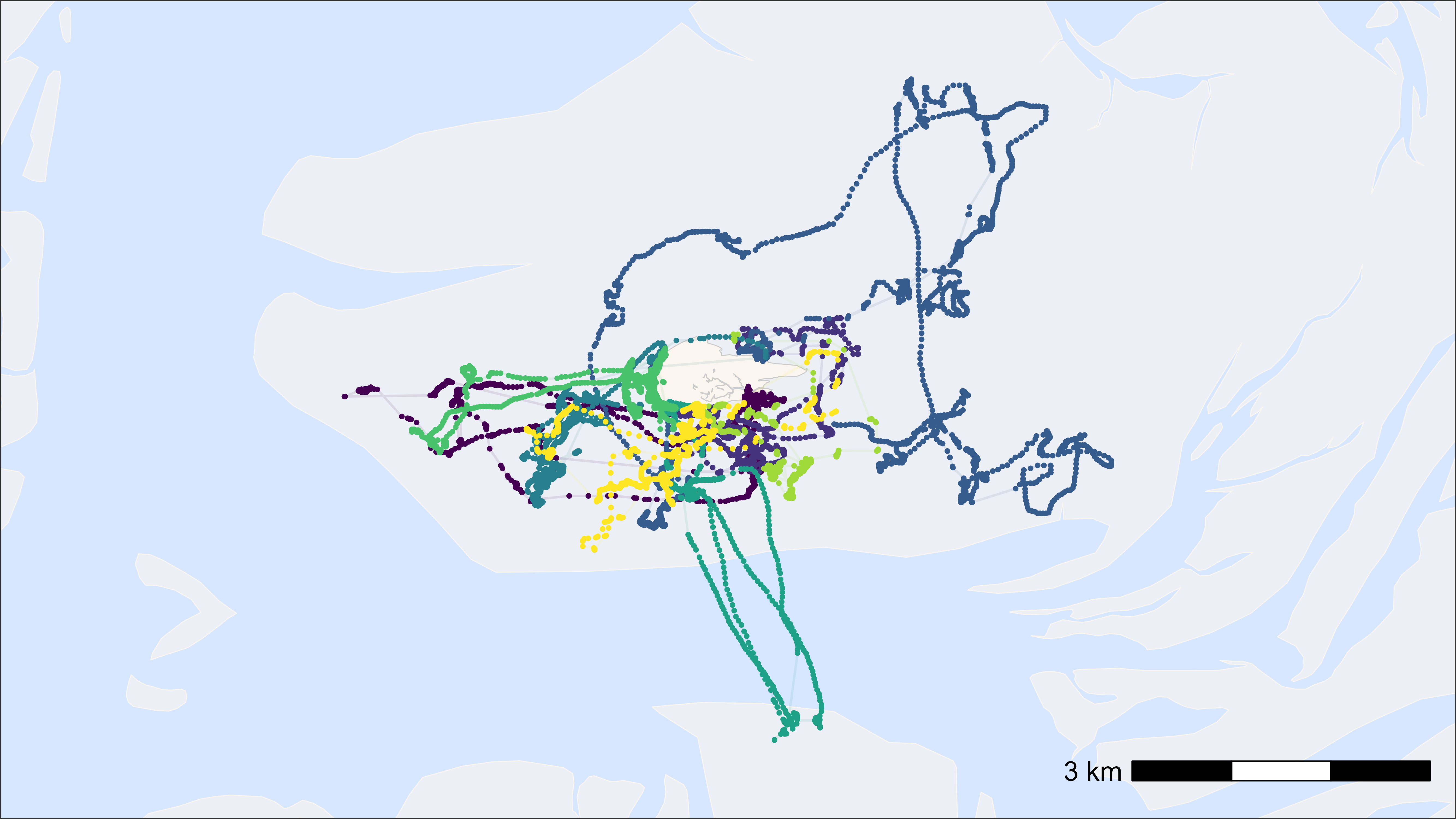
We can also add more information to the label by using the
atl_tag_labs() function. This function can be used to
create labels for the legend that include more information about the
tag, such as metal rings, colour rings or name.
# load example data
data <- data_example

# file path to the metadata
fp <- system.file(
  "extdata", "tags_watlas_subset.xlsx", package = "tools4watlas"
)

# load meta data
all_tags <- readxl::read_excel(fp, sheet = "tags_watlas_all") |>
  data.table()

# join with metal rings and color rings
all_tags[, tag := as.character(tag)]
data[all_tags, on = "tag", `:=`(
  rings = i.rings,
  crc = i.crc
)]

# create basemap
bm <- atl_create_bm(data, buffer = 800)

# plot points and tracks with fixed assigned colours (e.g. in animations)
bm +
  geom_path(
    data = data, aes(x, y, colour = tag),
    linewidth = 0.5, alpha = 0.1, show.legend = TRUE
  ) +
  geom_point(
    data = data, aes(x, y, colour = tag),
    size = 0.5, alpha = 1, show.legend = TRUE
  ) +
  scale_color_manual(
    values = atl_tag_cols(data$tag),
    labels = atl_tag_labs(data, c("tag", "rings", "crc")),
    name = paste("N = ", length(unique(data$tag)))
  ) +
  theme(legend.position = "top")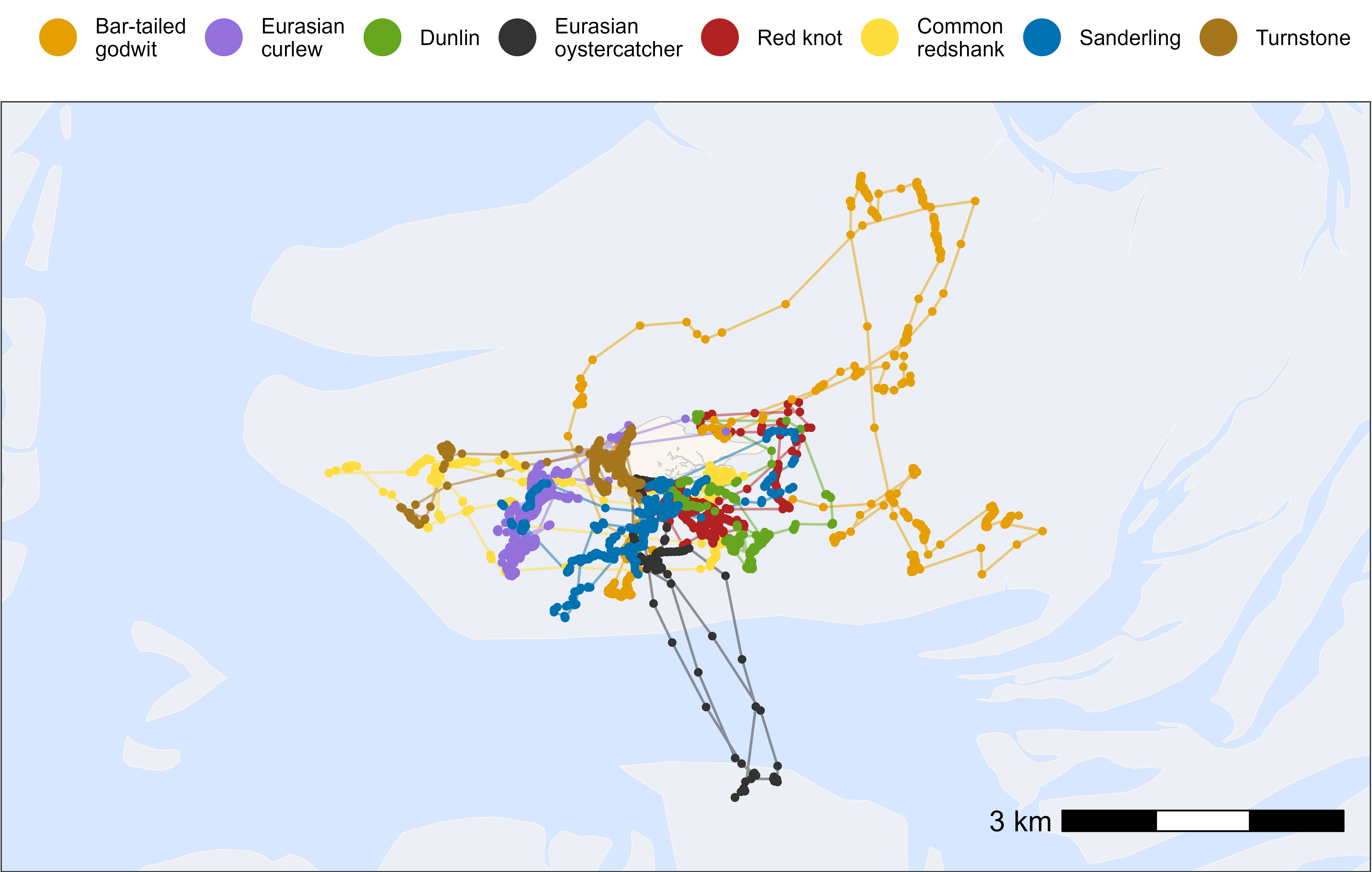
Plot by species
Here, we show how to plot movement data grouped and coloured by
species. tools4watlas includes specific species colours in
the atl_spec_cols() function and species labels in the
atl_spec_labs() function.
# load example data
data <- data_example

# create basemap
bm <- atl_create_bm(data, buffer = 800)

# plot points and tracks
bm +
  geom_path(
    data = data, aes(x, y, group = tag, colour = species),
    linewidth = 0.5, alpha = 0.5, show.legend = FALSE
  ) +
  geom_point(
    data = data, aes(x, y, color = species),
    size = 1, alpha = 1, show.legend = TRUE
  ) +
  scale_color_manual(
    values = atl_spec_cols(),
    labels = atl_spec_labs("multiline"),
    name = ""
  ) +
  guides(colour = guide_legend(
    nrow = 1, override.aes = list(size = 7, pch = 16, alpha = 1)
  )) +
  theme(
    legend.position = "top",
    legend.justification = "center",
    legend.key = element_blank(),
    legend.background = element_rect(fill = "transparent")
  )
Plot single tag
Here, we show how to plot movement data per individual tag ID.
Simple plot-template
Here, we show a simple template for plotting an individual tag ID, which can be customized as desired.
# load example data
data <- data_example

# subset bar-tailed godwit
data_subset <- data[species == "bar-tailed godwit"]

# create basemap
bm <- atl_create_bm(data_subset, buffer = 800)

# plot points and tracks
bm +
  geom_path(
    data = data_subset, aes(x, y),
    linewidth = 0.5, alpha = 0.1, show.legend = FALSE
  ) +
  geom_point(
    data = data_subset, aes(x, y),
    size = 0.5, alpha = 1, show.legend = FALSE
  )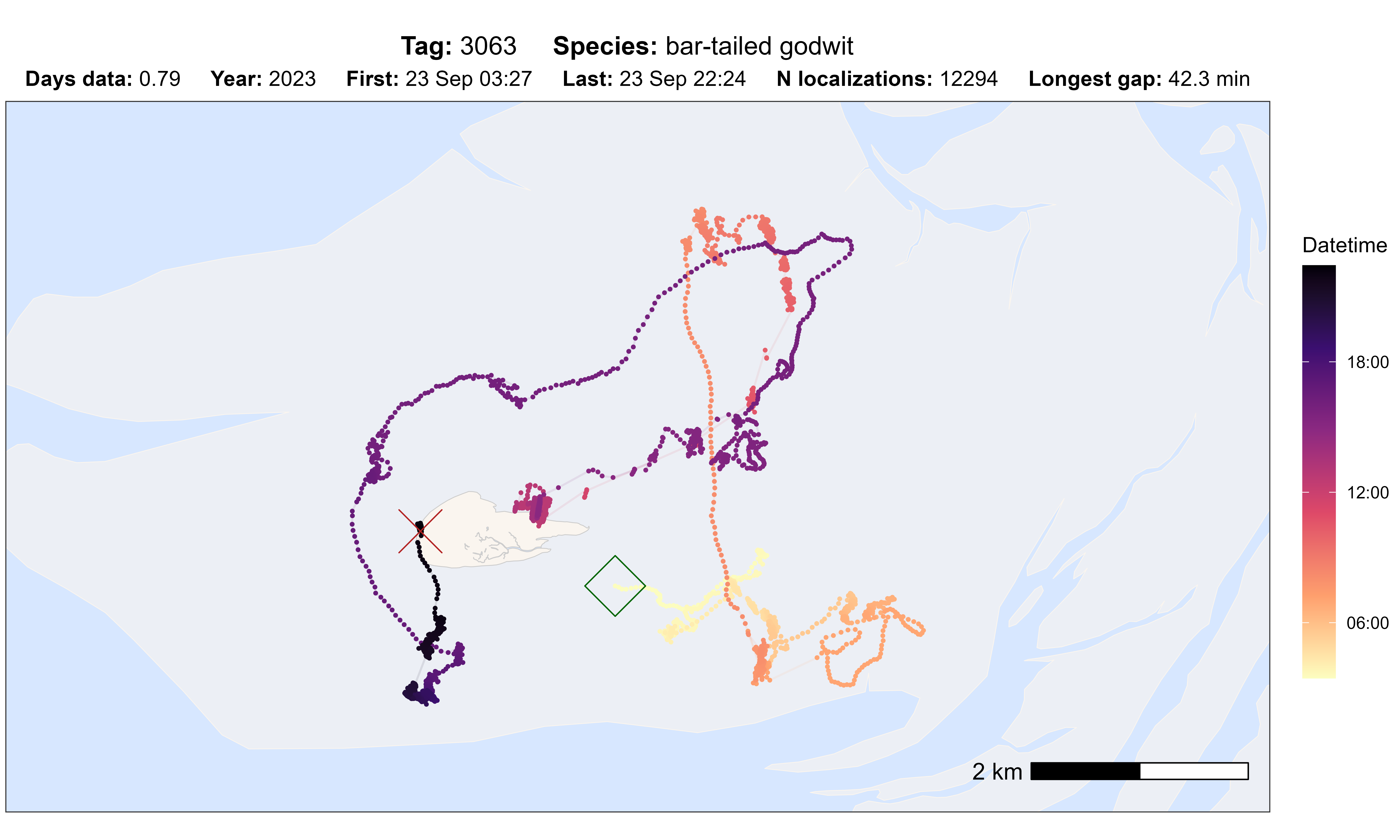
Quality inspection plots
The atl_check_tag() function can be used to quickly
check the data for one tag. It provides five different options for
colouring the track:
-
"datetime": Datetime along the track -
"nbs": Number of receiver (base) stations that contributed to the position -
"var": Error as maximum ofvarxandvary -
"speed_in": Speed in m/s -
"gap": Gaps coloured and scaled by duration
By specifying the scale_option, tracks can be coloured
differently using viridis
(defaults to "A"). The scale can also be transformed with
scale_trans, for example, using "log" or
"sqrt". First and last point can be highlighted
(highlight_first and highlight_last) or a
specific number of positions from the beginning or end of the track
(first_n or last_n).
# path to csv with filtered data
data_path <- system.file(
  "extdata", "watlas_data_filtered.csv",
  package = "tools4watlas"
)

# load data
data <- fread(data_path, yaml = TRUE)

# subset bar-tailed godwit
data <- data[species == "bar-tailed godwit"]

# plot option datetime
atl_check_tag(
  data,
  option = "datetime",
  highlight_first = TRUE, highlight_last = TRUE
)
# subset with last 1000 positions
atl_check_tag(
  data,
  last_n = 1000,
  option = "datetime",
  highlight_first = TRUE, highlight_last = TRUE
)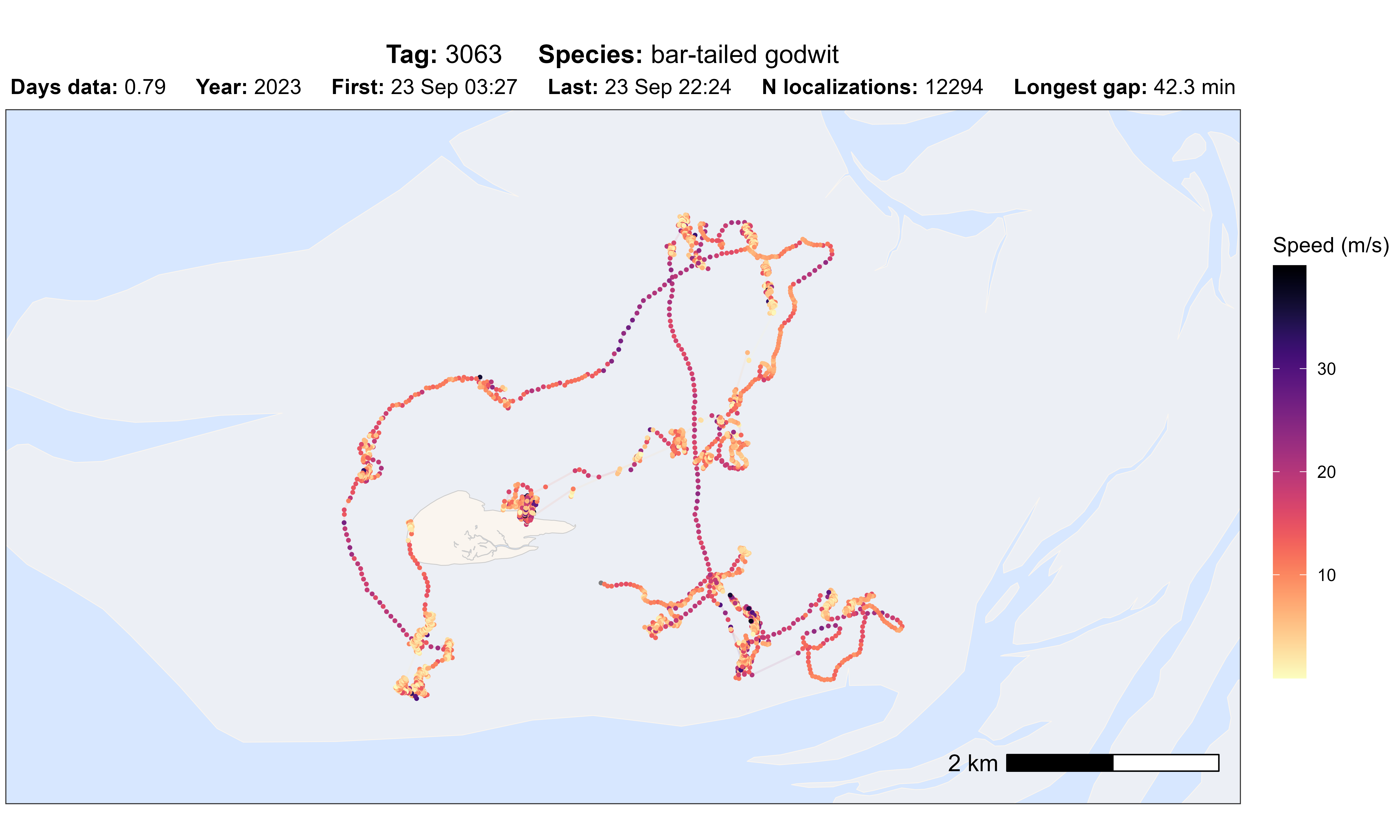
# plot option speed_in
atl_check_tag(data, option = "speed_in")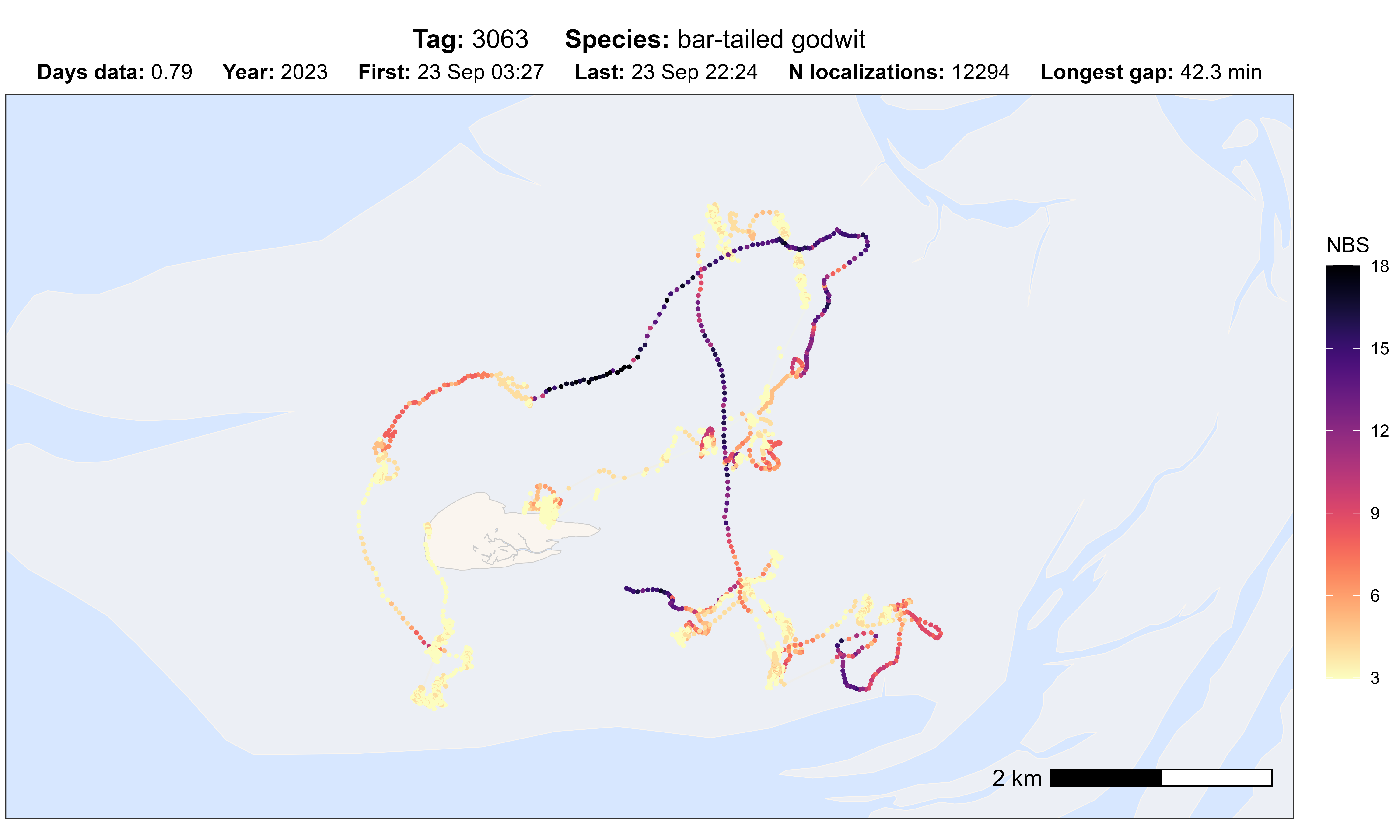
# plot option nbs
atl_check_tag(data, option = "nbs")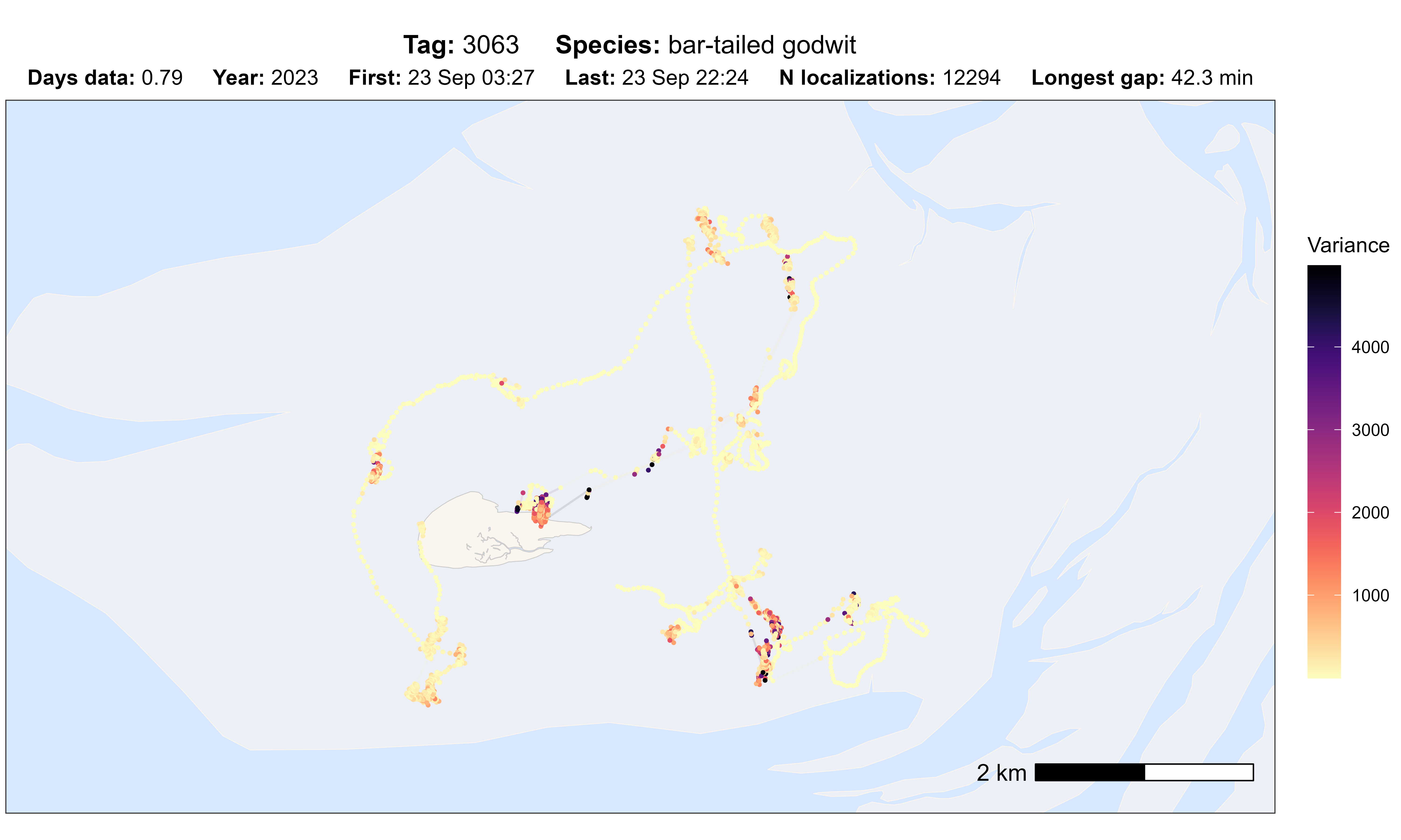
# plot option sd
atl_check_tag(data, option = "var")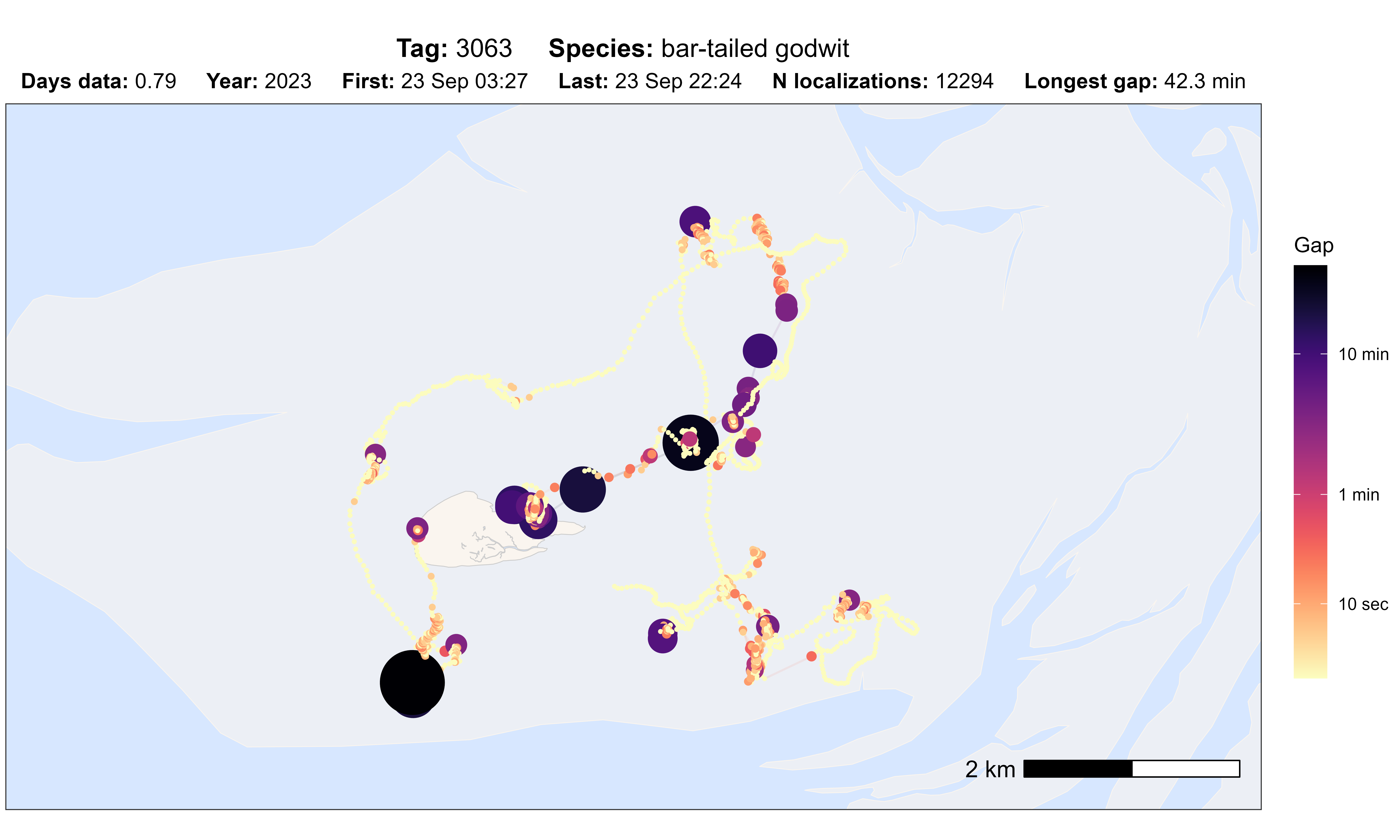
# plot option gap
atl_check_tag(data, option = "gap", scale_trans = "log")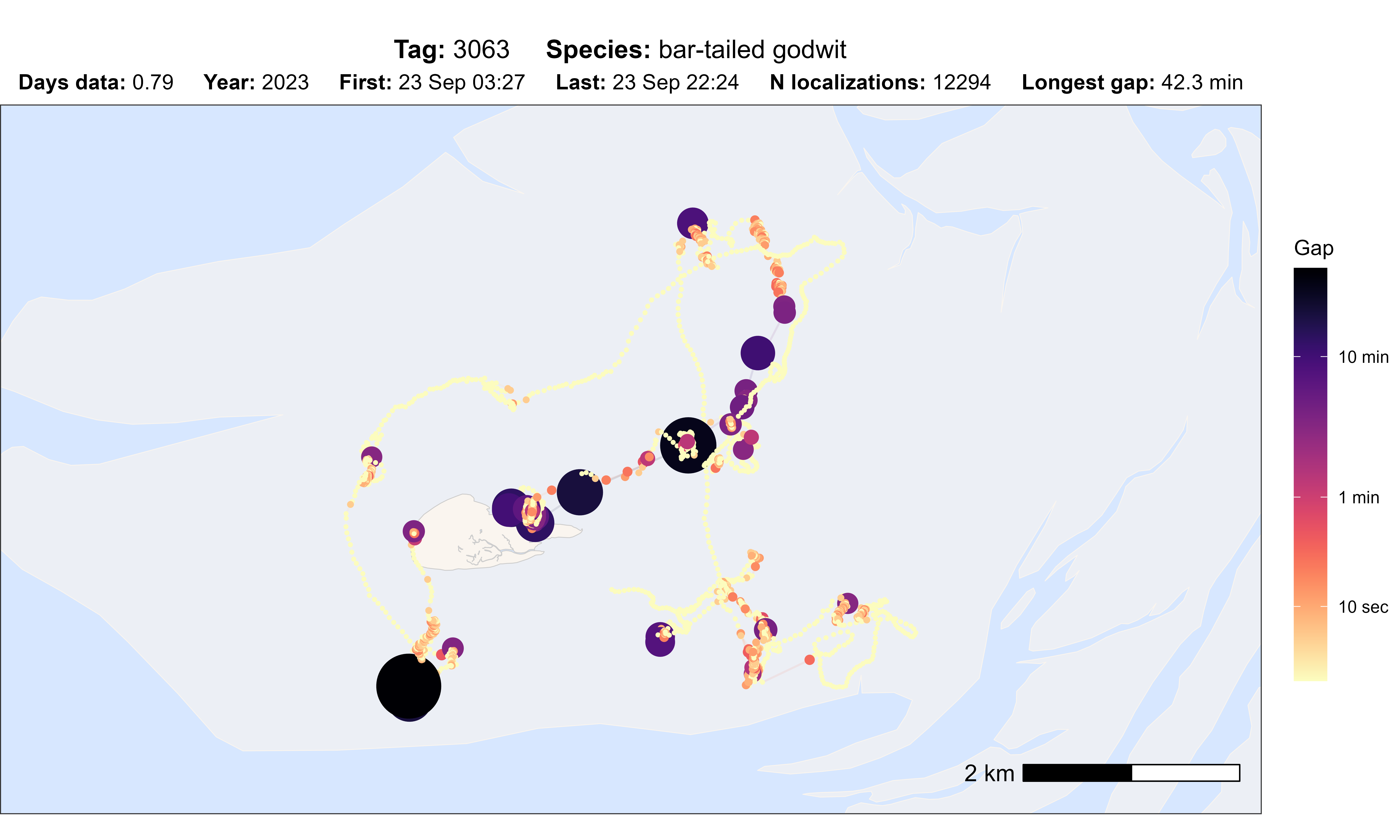
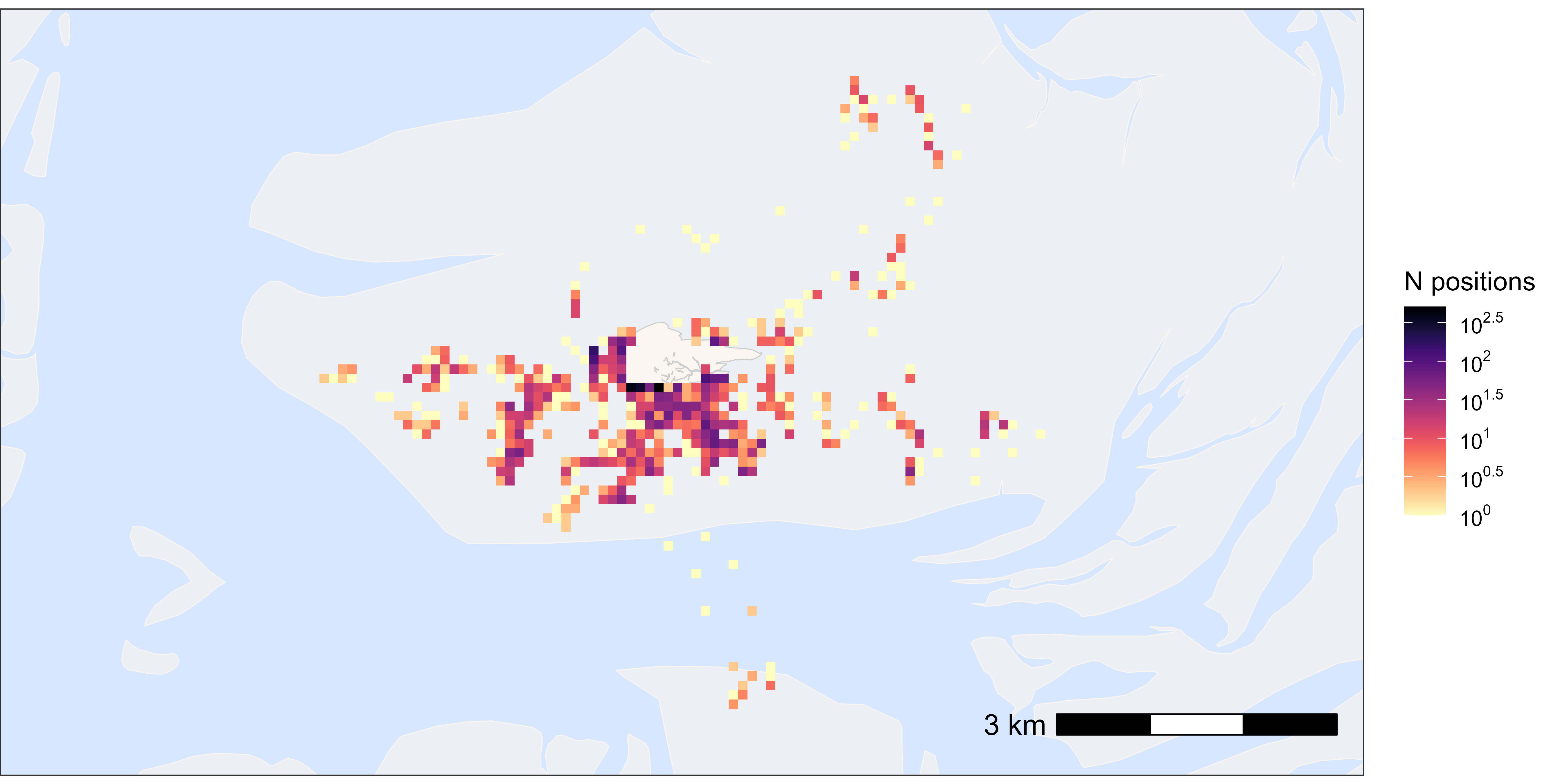
Heatmaps
Here, we provide examples of making heatmaps by rounding the tracking data (e.g. to 200 m) and then plotting the number of positions per location.
All positions
This is a quick way to get an overview of the data.
# load example data
data <- data_example

# create basemap
bm <- atl_create_bm(data, buffer = 800)

# round data to 1 ha (100x100 meter) grid cells
data[, c("x_round", "y_round") := list(
  plyr::round_any(x, 100),
  plyr::round_any(y, 100)
)]

# N by location
data_subset <- data[, .N, by = c("x_round", "y_round")]

# plot heatmap
bm +
  geom_tile(
    data = data_subset, aes(x_round, y_round, fill = N),
    linewidth = 0.1, show.legend = TRUE
  ) +
  scale_fill_viridis(
    option = "A", discrete = FALSE, trans = "log10", name = "N positions",
    breaks = trans_breaks("log10", function(x) 10^x),
    labels = trans_format("log10", math_format(10^.x)),
    direction = -1
  )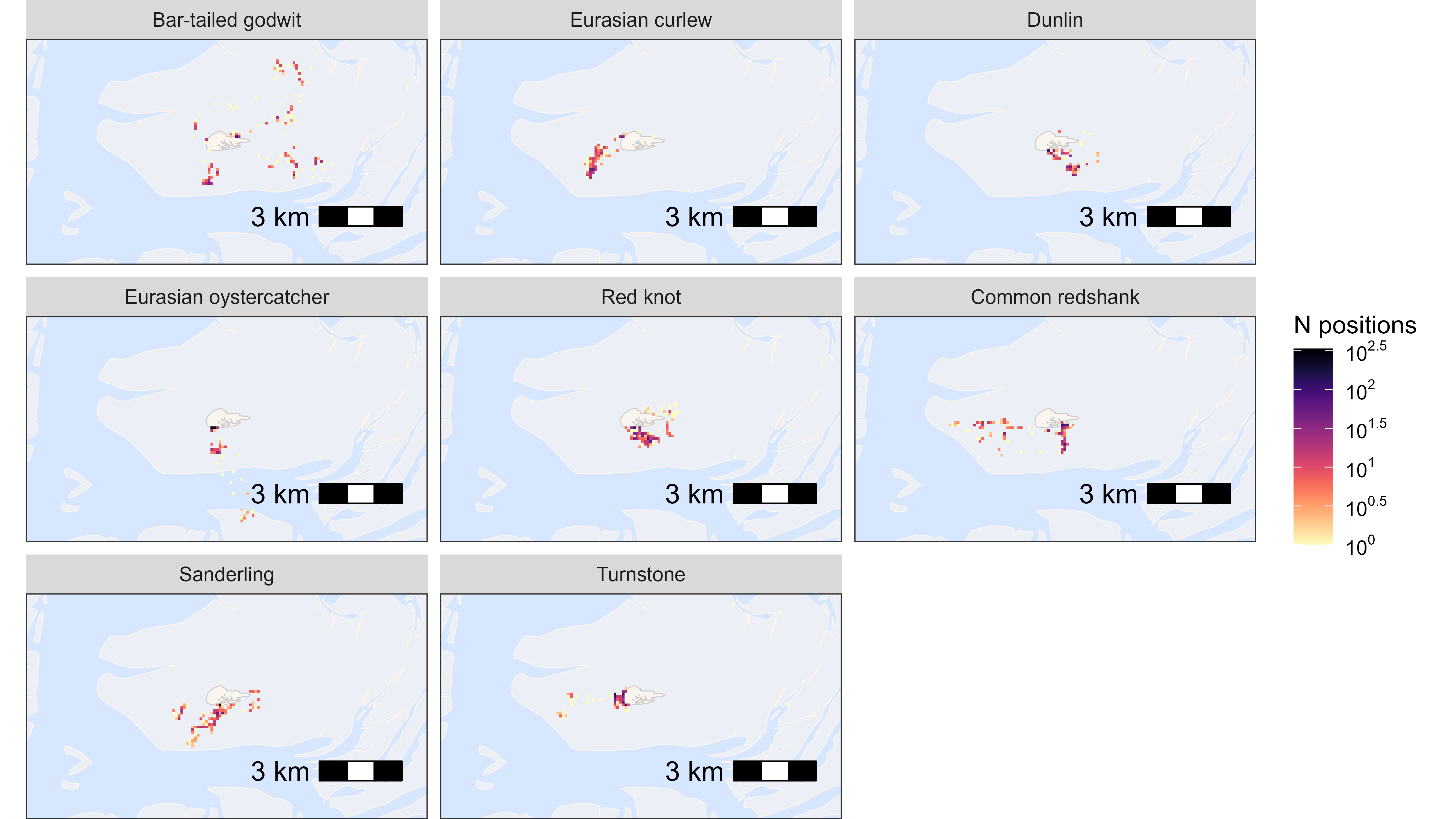
By species
Here, we plot data grouped by species, but this can be any group.
# N by location and species
data_subset <- data[, .N, by = c("x_round", "y_round", "species")]

# plot heatmap by species
bm +
  geom_tile(
    data = data_subset, aes(x_round, y_round, fill = N),
    linewidth = 0.1, show.legend = TRUE
  ) +
  scale_fill_viridis(
    option = "A", discrete = FALSE, trans = "log10", name = "N positions",
    breaks = trans_breaks("log10", function(x) 10^x),
    labels = trans_format("log10", math_format(10^.x)),
    direction = -1
  ) +
  facet_wrap(~species, labeller = as_labeller(atl_spec_labs("singleline")))