Plot data faster
Source:vignettes/visualization_tutorials/plot_data_faster.Rmd
plot_data_faster.RmdPlotting in R can get really slow down when using big data sets, like high-throughput WATLAS tracking data that have >50 million positions in one season. There are two things to consider: 1) the necessary content of the plot (practical side) and 2) plotting performance (technical side).
The necessary content of the plot
For what do you want to plot the data? A quick look or a publication? What do you want to see with the plot? An overview of all positions or a specific part of the track? Depending on your answers, choose the smallest suitable dataset. For example, thinning the data (e.g. to one or 10-min intervals) can greatly reduce the number of localization to be plotted and, therefore, speed-up plotting. When plotting a lot of data, it can be better to plot a heat map (which is the fastest way of plotting many localization) than many single positions that just overlap and are anyway not seen clearly.
Plotting performance
One way to speed up plotting is to switch from the R standard
grDevices to ragg that
provides both higher
performance (up to 40% faster) and higher
quality than the standard raster devices. ragg can be
used as the graphic back-end to the RStudio device by choosing AGG as
the backend in the graphics pane in general options (see).
To further speed up plotting with ggplot2, it helps to
plot points simply as pch = ".", to use geom_scattermore(),
or to summarize locations and plot them as heat map. See below examples
of each option. Note that the run time at the end of each chunk should
be seen as relative and should be faster when the code is not complied,
but simply run.
Load packages and data
This vignette shows different ways on how to plot WATLAS data. Each chunk of code only requires this chunk with loading the data to be run before and is otherwise independent.
# packages
library(tools4watlas)
library(data.table)
library(sf)
## Warning: package 'sf' was built under R version 4.5.3Create dummy data and map
Create dummy tracks of 300 individuals for 1000 steps (3000.000 points).
# set seed for reproducibility
set.seed(123)

# define parameters
n_individuals <- 300 # number of individuals
interval <- 6 # time interval in seconds
n_steps <- 1000 # number of time steps per individual

# reference location (Griend) in UTM Zone 31N
griend <- st_sfc(st_point(c(5.2525, 53.2523)), crs = st_crs(4326)) |>
  st_transform(crs = st_crs(32631)) |>
  st_coordinates()

# generate initial positions
initial_positions <- data.table(
  tag = 1:n_individuals,
  x = rnorm(n_individuals, mean = griend[1], sd = 50),
  y = rnorm(n_individuals, mean = griend[2], sd = 50)
)

# create tracking data
data <- rbindlist(lapply(1:n_individuals, function(id) {
  # generate timestamps
  timestamps <- seq.POSIXt(
    from = Sys.time(), by = interval, length.out = n_steps
  )

  # simulate movement with small random steps
  x_mov <- cumsum(runif(n_steps, -100, 100))
  y_mov <- cumsum(runif(n_steps, -100, 100))

  # compute positions
  x <- initial_positions[tag == id, x] + x_mov
  y <- initial_positions[tag == id, y] + y_mov

  data.table(tag = as.character(id), x = x, y = y, datetime = timestamps)
}))

# create basemap
bm <- atl_create_bm(data, buffer = 3000)
ggplot2 standard
# start time
st <- Sys.time()

# plot
bm +
  geom_path(
    data = data, aes(x, y, colour = tag), alpha = 0.1,
    show.legend = FALSE
  ) +
  geom_point(
    data = data, aes(x, y, colour = tag), size = 0.5,
    show.legend = FALSE
  ) +
  scale_colour_viridis(discrete = TRUE)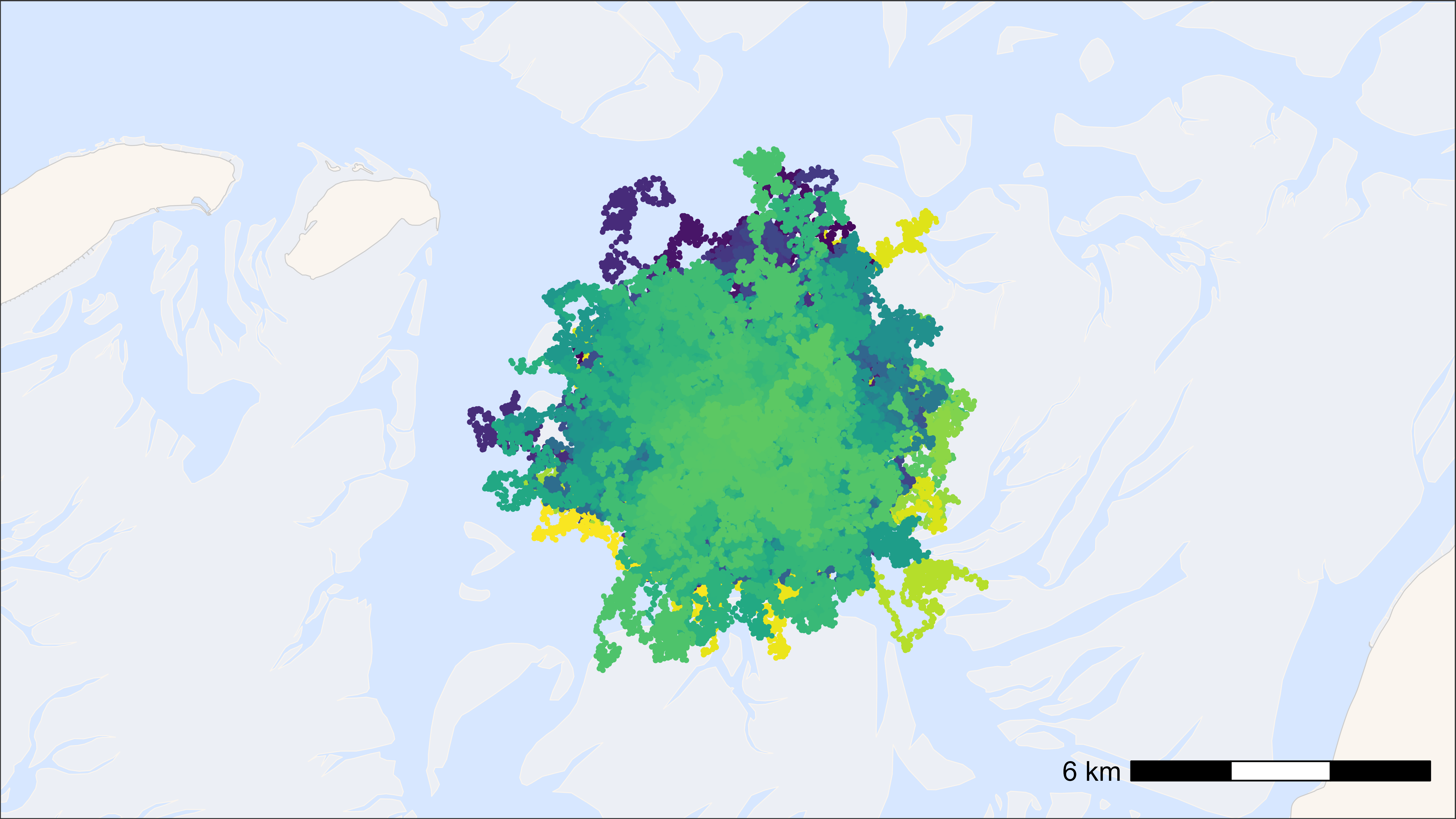
## Time difference of 6.29 secs
ggplot2 with points as pch = “.”
# start time
st <- Sys.time()

# plot
bm +
  geom_path(
    data = data, aes(x, y, colour = tag), alpha = 0.1,
    show.legend = FALSE
  ) +
  geom_point(
    data = data, aes(x, y, colour = tag), pch = ".", size = 0.5,
    show.legend = FALSE
  ) +
  scale_colour_viridis(discrete = TRUE)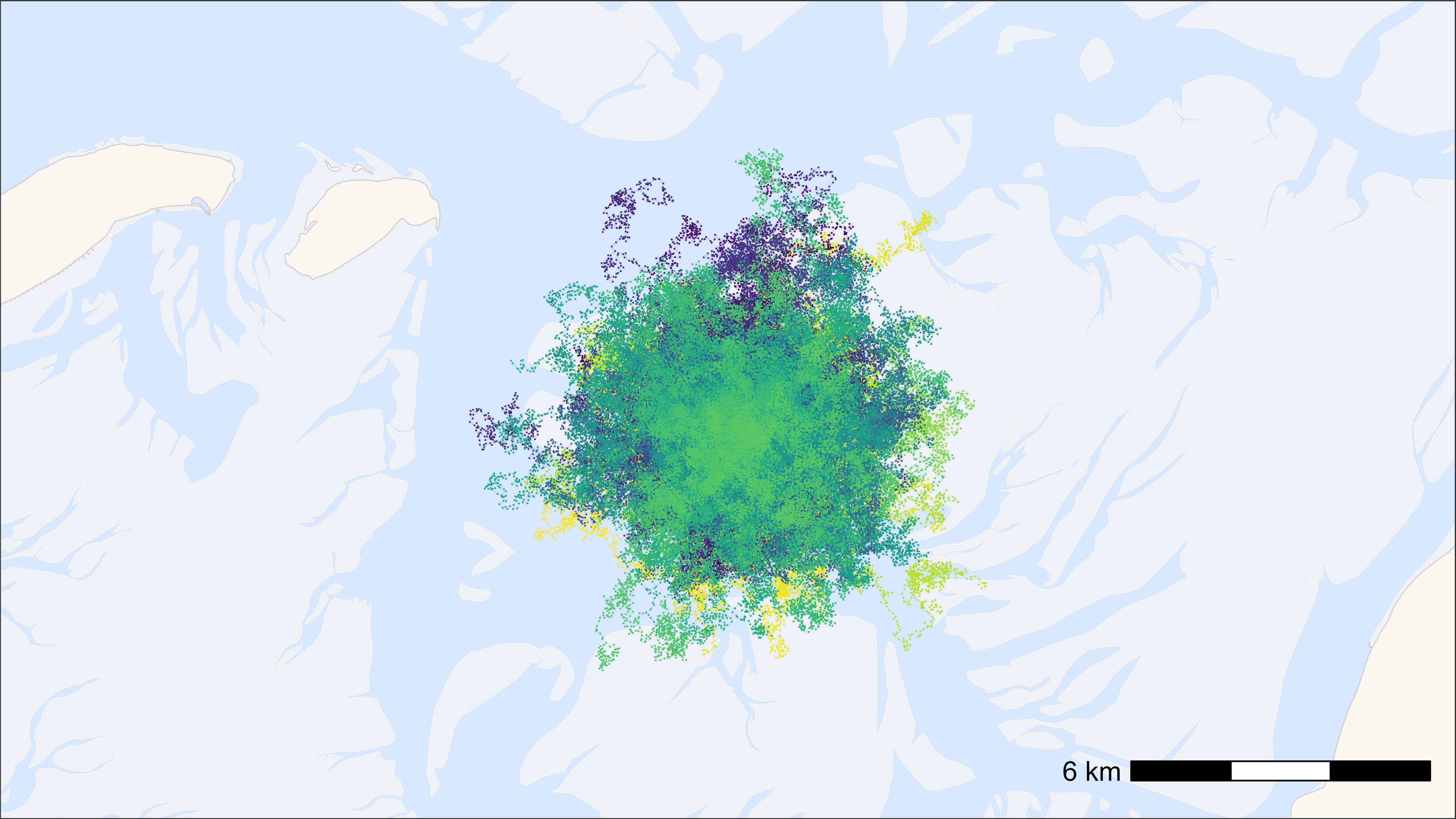
## Time difference of 2.37 secs
ggplot2 with points as geom_scattermore()
# start time
st <- Sys.time()

# plot
bm +
  geom_path(
    data = data, aes(x, y, colour = tag), alpha = 0.1,
    show.legend = FALSE
  ) +
  geom_scattermore(
    data = data, aes(x, y, colour = tag), pch = ".", size = 0.5,
    show.legend = FALSE
  ) +
  scale_colour_viridis(discrete = TRUE)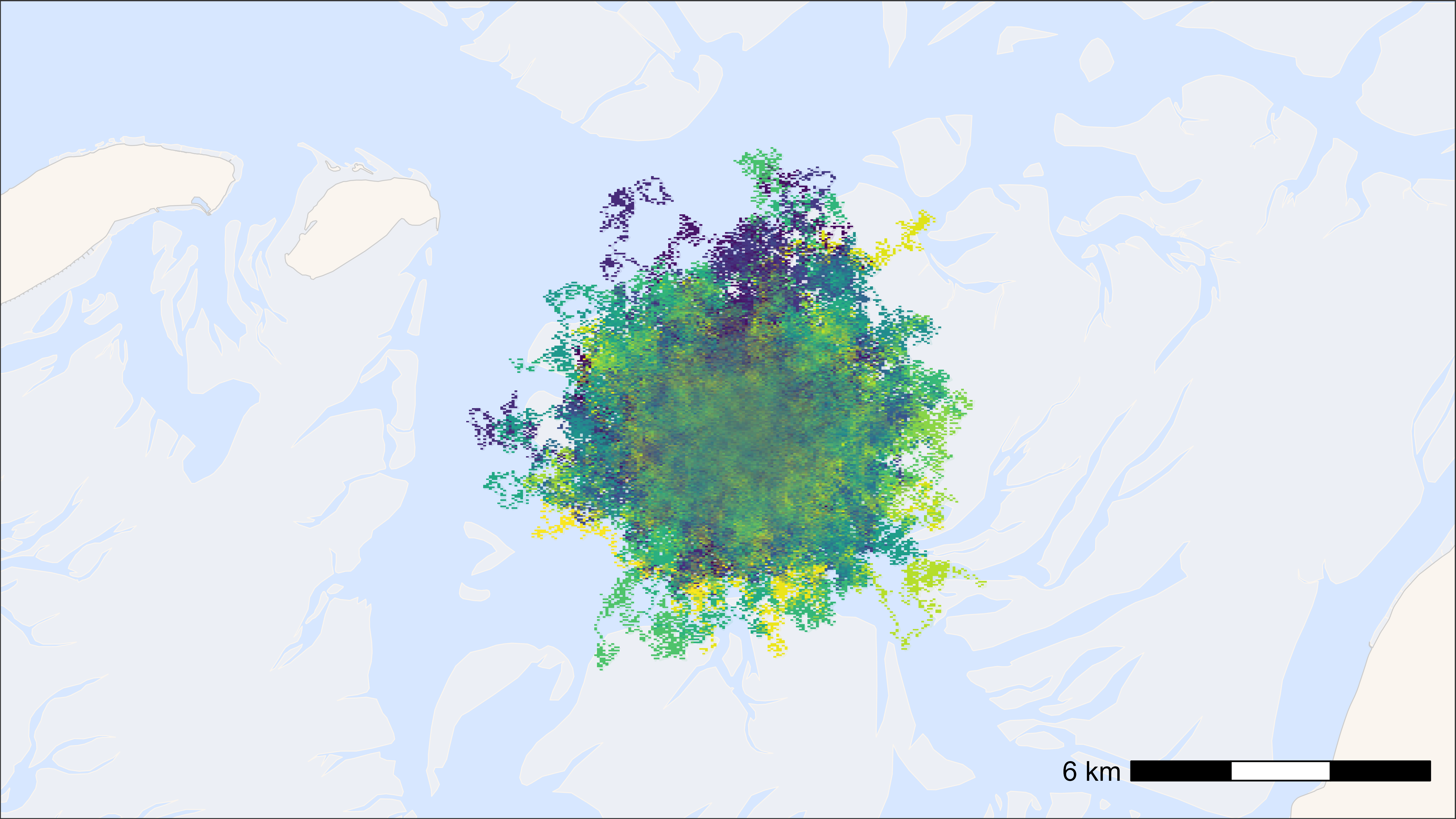
## Time difference of 1.64 secs
ggplot2 heat map
The larger the grid cell size, the faster.
# round data to 1 ha (100x100 meter) grid cells
data[, c("x_round", "y_round") := list(
  plyr::round_any(x, 100),
  plyr::round_any(y, 100)
)]

# N by location
data_subset <- data[, .N, by = c("x_round", "y_round")]

# start time
st <- Sys.time()

# plot heat map
bm +
  geom_tile(
    data = data_subset, aes(x_round, y_round, fill = N),
    linewidth = 0.1, show.legend = TRUE
  ) +
  scale_fill_viridis(
    option = "A", discrete = FALSE, trans = "log10", name = "N positions",
    breaks = trans_breaks("log10", function(x) 10^x),
    labels = trans_format("log10", math_format(10^.x)),
    direction = -1
  )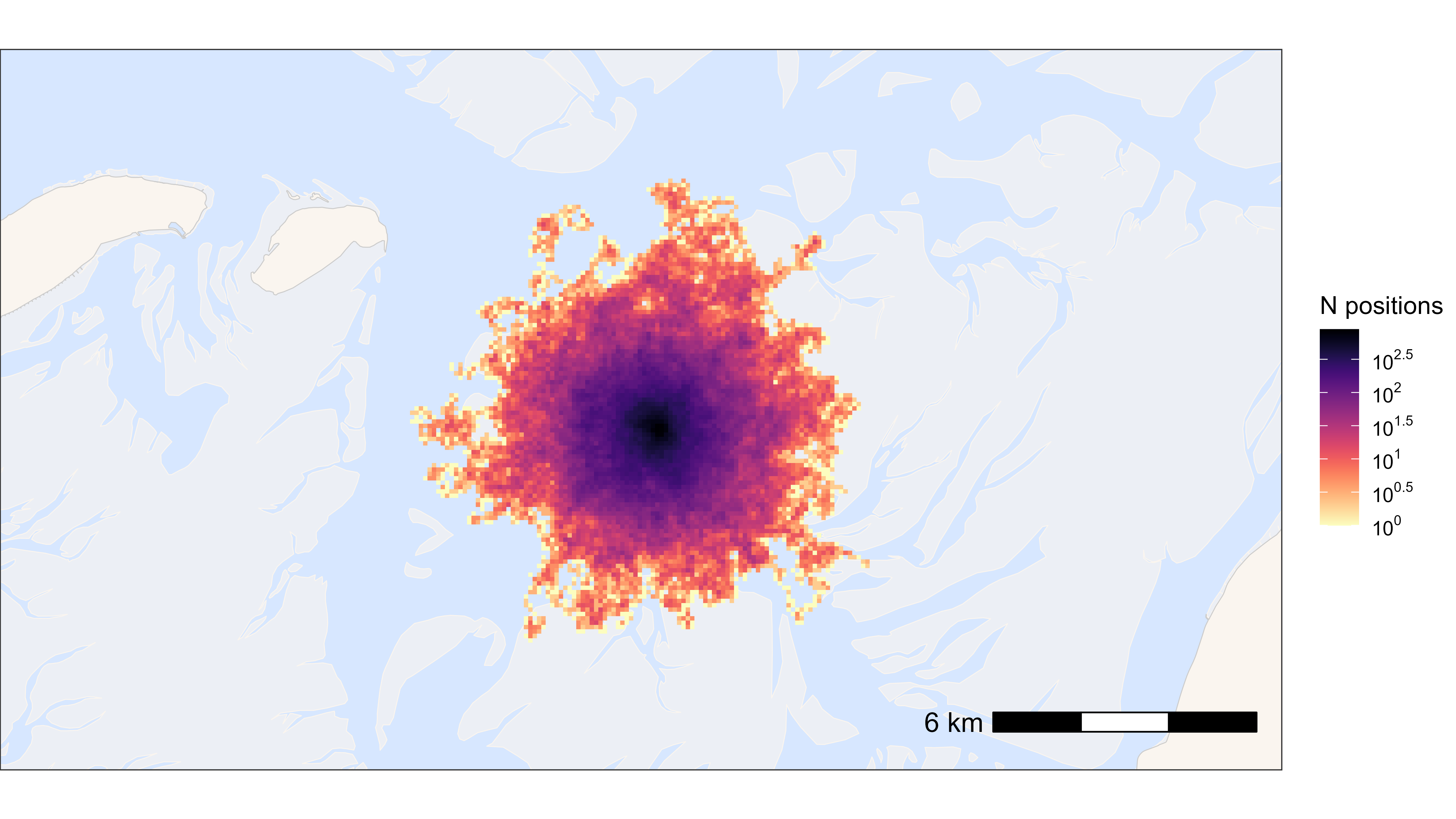
## Time difference of 0.35 secsFast saving with ragg
Example to save a png in 16:9 and 4 k.
# example plot
p <- atl_create_bm(buffer = 5000)

# save png
agg_png(
  filename = "path/to/file/name.png",
  width = 3840, height = 2160, units = "px", res = 300
)
print(p)
dev.off()